1000 friends of oregon
1000 Friends of Oregon is a public interest nonprofit focused on promoting healthy urban and rural communities in Oregon, while also preserving the state's legendary natural beauty. Their efforts include promoting responsible land-use planning, championing economic development within growth boundaries, and ensuring a strong voice for all Oregonians in development decisions. However, the organization felt that its image and messaging were starting to lag behind its mission, and its digital presence did not sufficiently resonate with the evolving audience.
problem
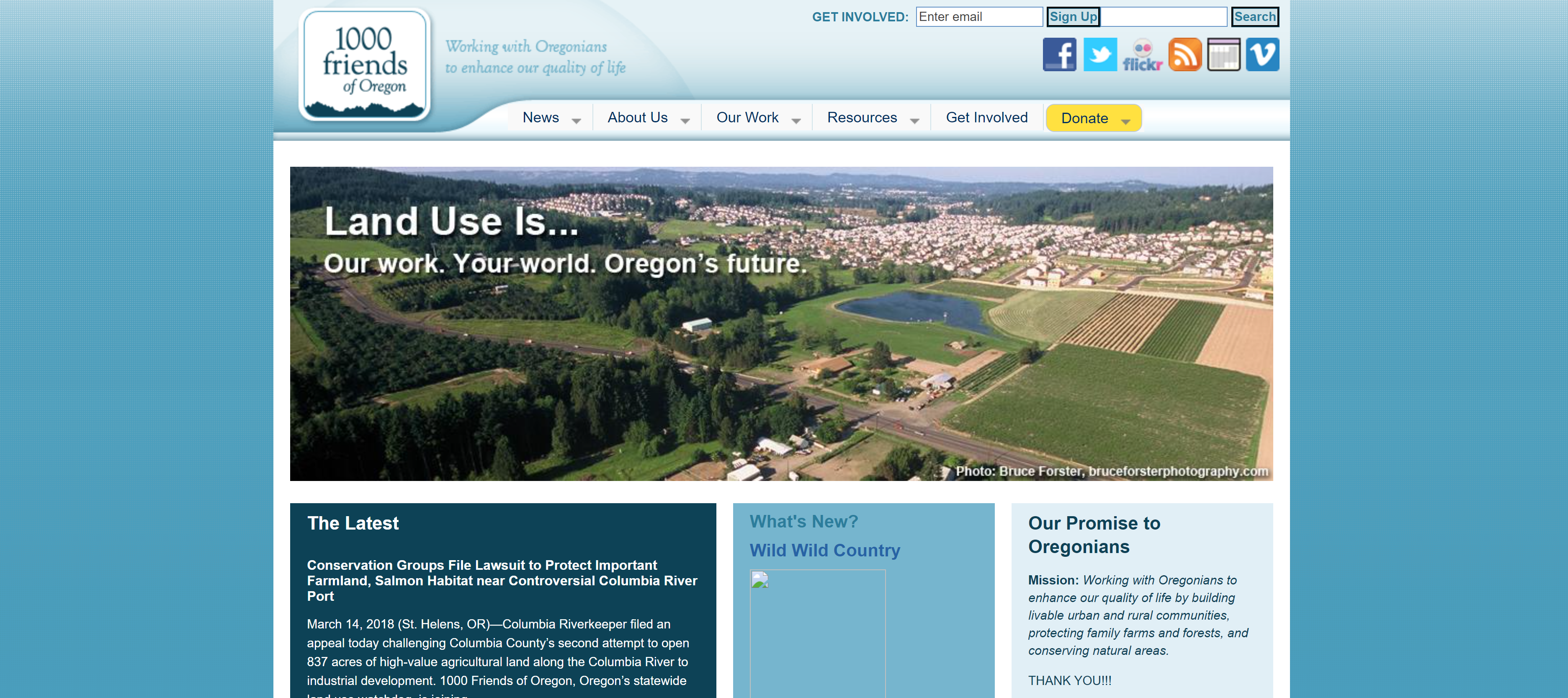
The need for a brand refresh was driven by two major factors. Firstly, their existing brand image seemed dated and did not adequately represent the dynamic, forward-thinking nature of the organization. The second was a practical consideration: a more modern, versatile branding would better connect with the younger demographic and digital natives, allowing 1000 Friends of Oregon to expand their influence and reach.
goal
The main objective of the rebrand was to create a contemporary and relatable image that captures the essence of the Oregonian landscape and the organization's core values. The ambition was not only to appeal to a younger audience but also to make the brand more accessible and user-friendly to enhance engagement levels across all demographics.
process
Custom Color Scheme
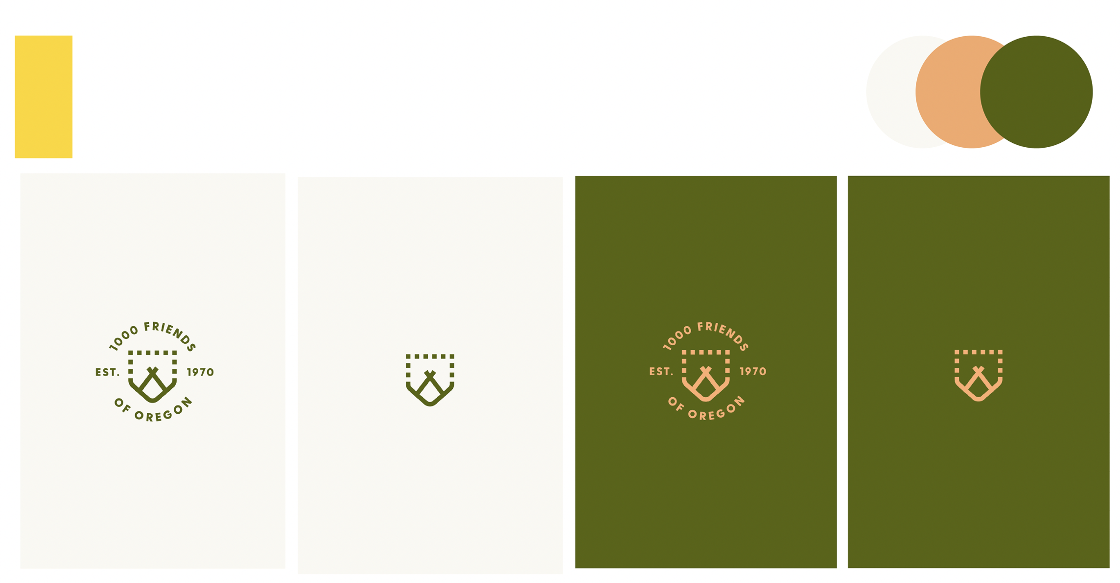
The new color scheme took inspiration directly from Oregon's diverse landscape, ranging from its green forests, blue rivers, and coastline to its more arid eastern regions. This created a visually appealing and fresh palette that captures the true spirit of Oregon and the organization's commitment to its preservation.
Custom Icon Bank
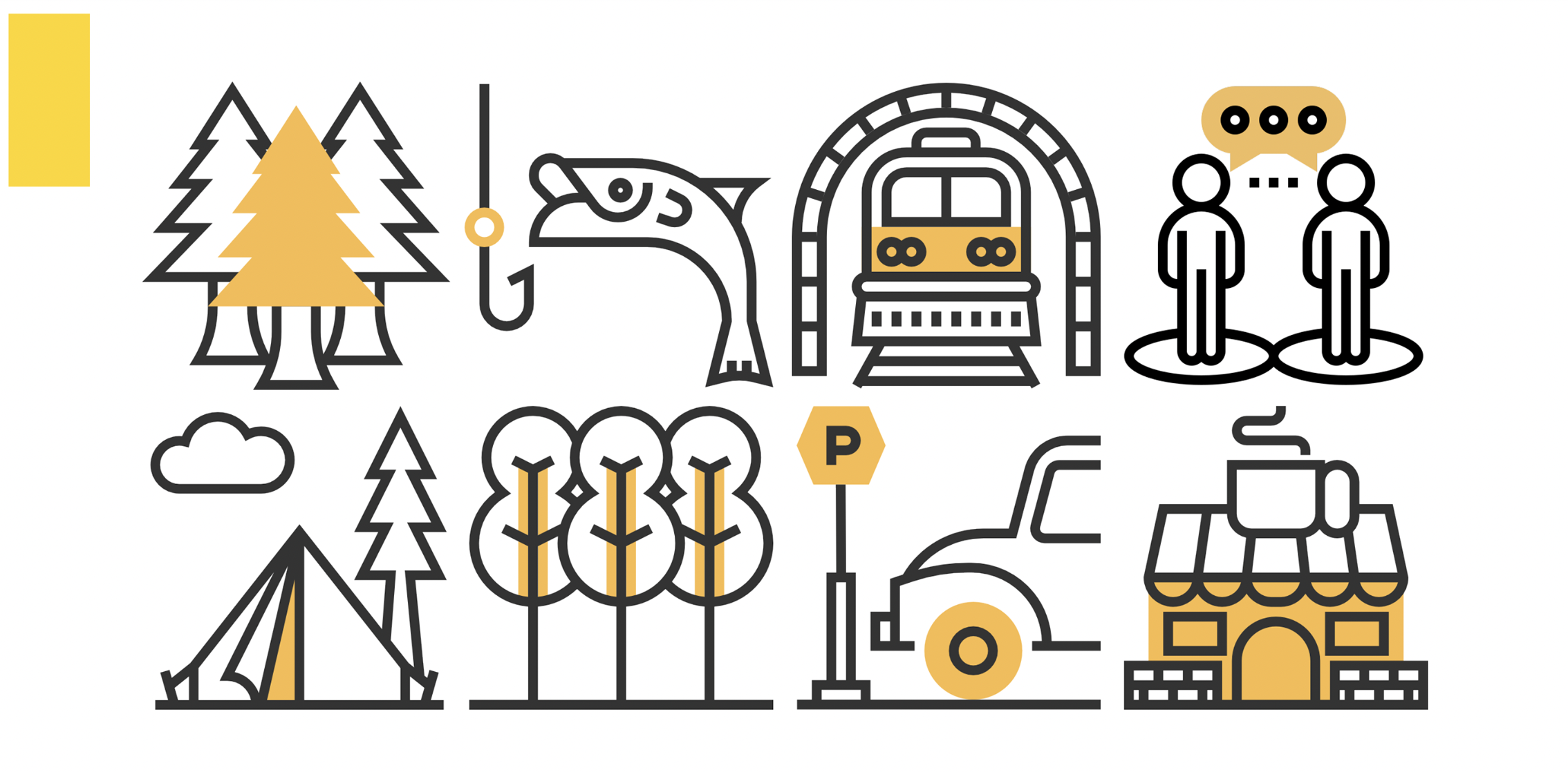
To simplify the creation of future in-house collateral and ensure consistency, a custom icon bank was developed. These versatile and visually appealing icons enable the team to communicate complex ideas quickly and clearly, providing a powerful tool for their internal communications.
Website Prototype in Adobe XD
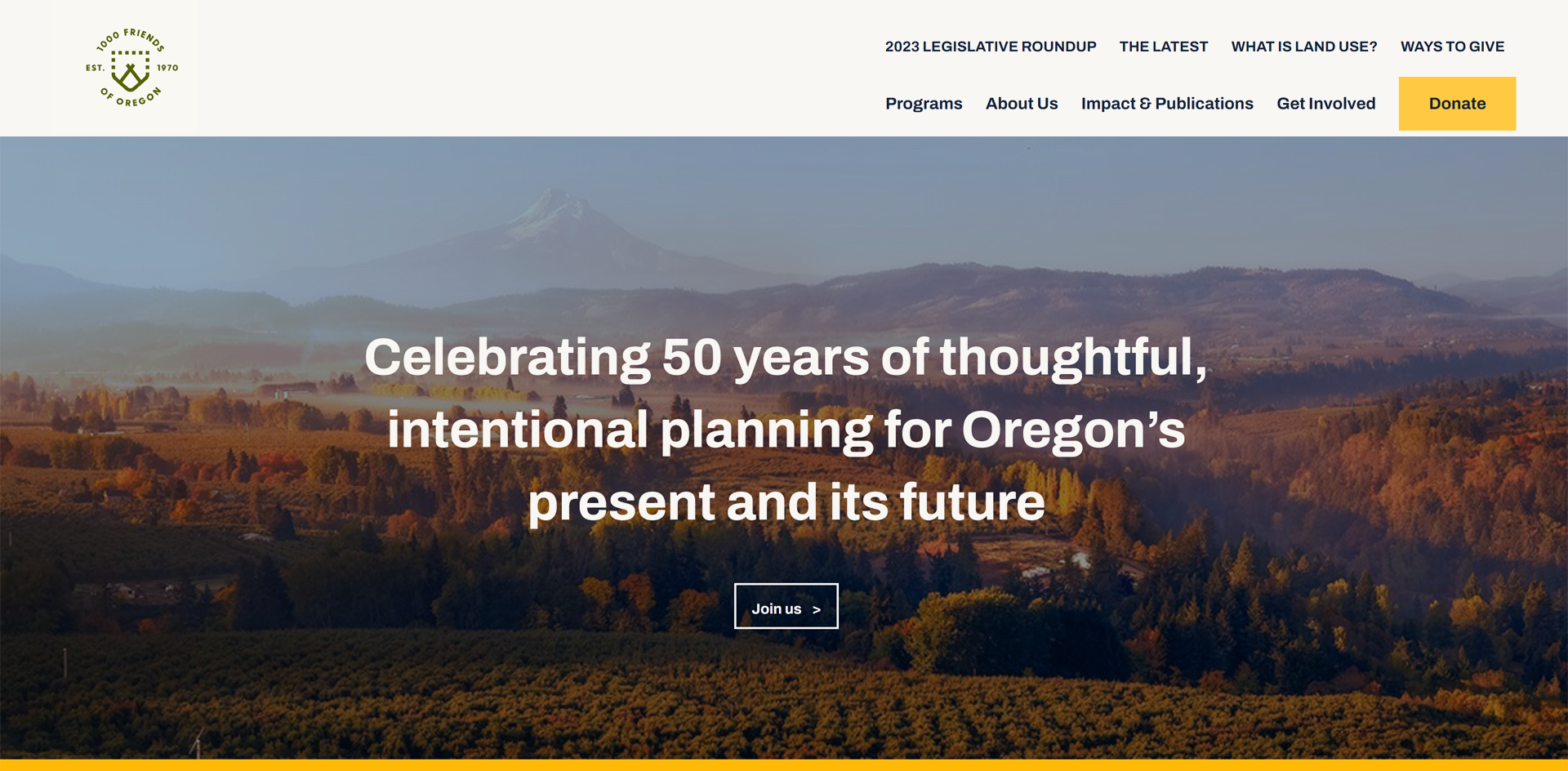
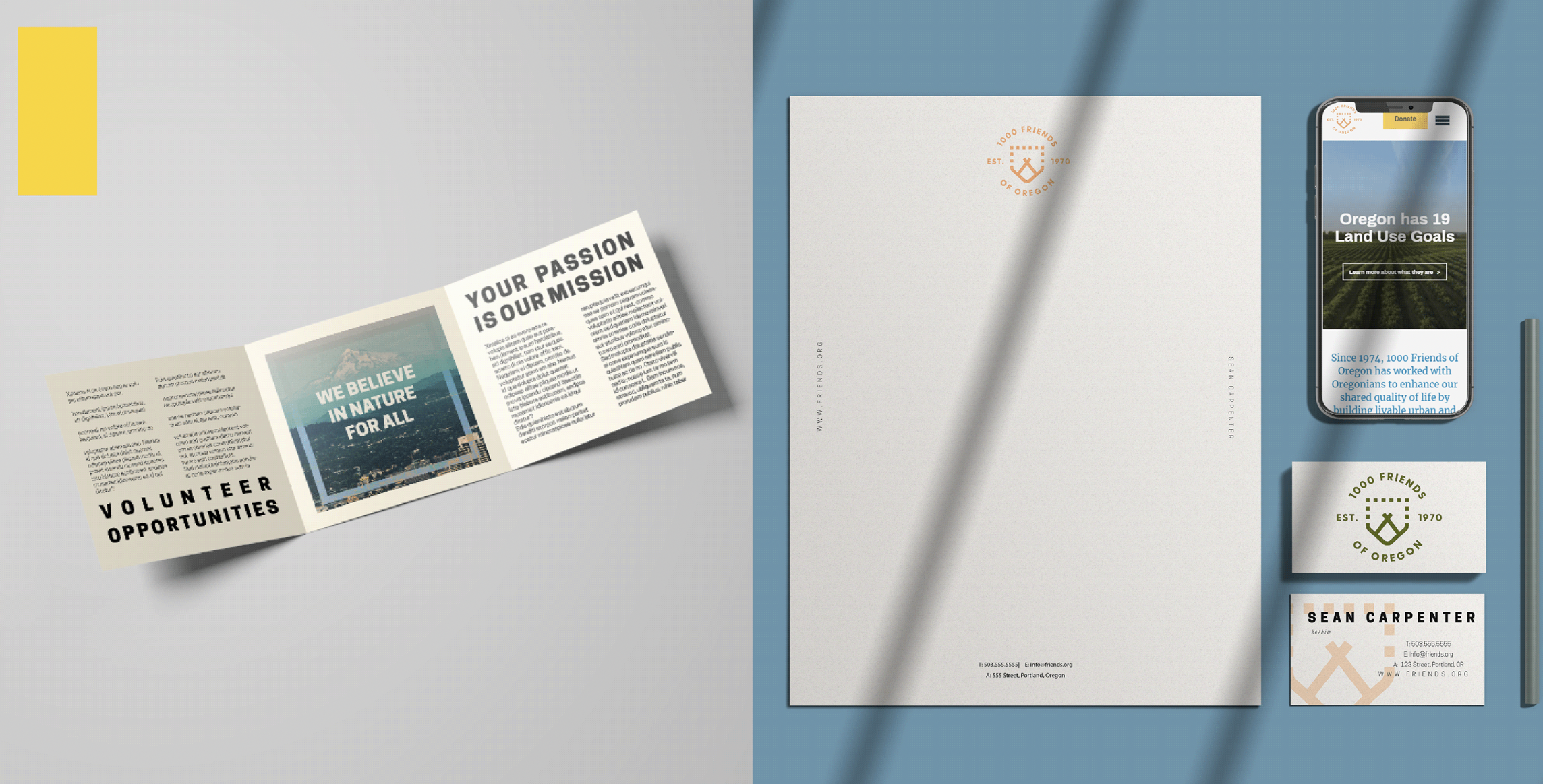
To improve user experience, a new website prototype was developed in Adobe XD. The website was reimagined with user-friendly navigation, appealing visuals, and clear, persuasive content that highlights the organization's mission and initiatives. It is designed to facilitate better engagement with stakeholders and a wider audience.
Collateral Material
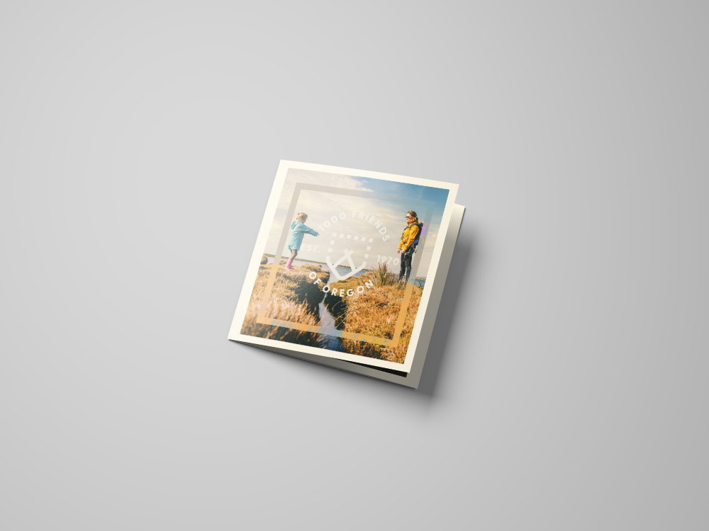
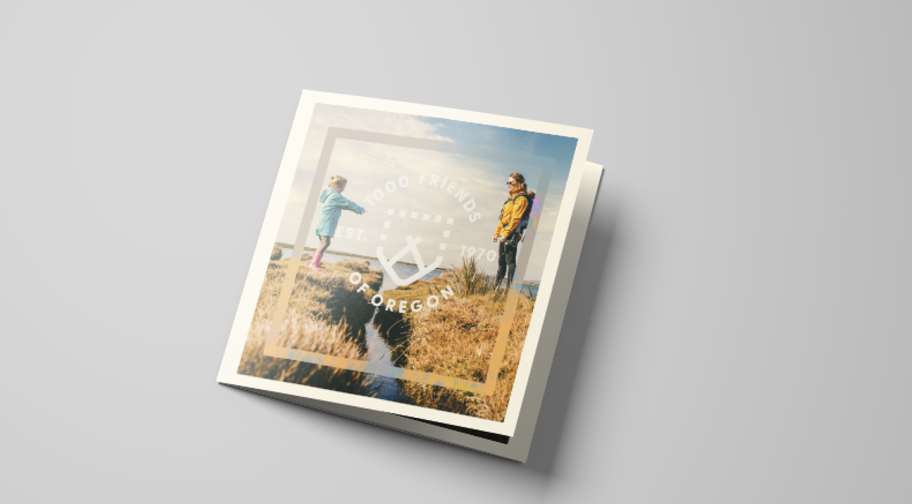
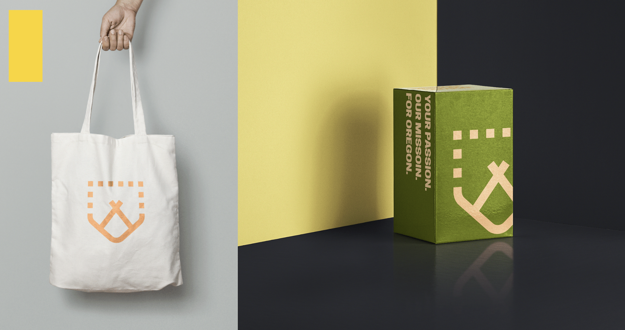
The rebranding process also involved the creation of new, visually consistent collateral. This included brochures, pamphlets, fliers, and donor swag, all bearing the new branding and color scheme. These materials serve to extend the reach of the organization, making it easier to connect with donors, supporters, and the general public.
final product
The final product of this rebrand was a modern, accessible, and engaging brand identity that resonates with both the history and future of Oregon. The new brand is designed to allow 1000 Friends of Oregon to better communicate their vision and mission to a broader audience and ensure they can continue their critical work for the state's urban and rural communities.

Selected Works

